Note: I do not own the codes below. This is identical to the codes from the above URL and is just used for practicing EDA.
Preparations
1 | plt.style.use('bmh') |
1 | df = pd.read_csv('train.csv') |
| Id | MSSubClass | MSZoning | LotFrontage | LotArea | Street | Alley | LotShape | LandContour | Utilities | ... | PoolArea | PoolQC | Fence | MiscFeature | MiscVal | MoSold | YrSold | SaleType | SaleCondition | SalePrice | |
|---|---|---|---|---|---|---|---|---|---|---|---|---|---|---|---|---|---|---|---|---|---|
| 0 | 1 | 60 | RL | 65.0 | 8450 | Pave | NaN | Reg | Lvl | AllPub | ... | 0 | NaN | NaN | NaN | 0 | 2 | 2008 | WD | Normal | 208500 |
| 1 | 2 | 20 | RL | 80.0 | 9600 | Pave | NaN | Reg | Lvl | AllPub | ... | 0 | NaN | NaN | NaN | 0 | 5 | 2007 | WD | Normal | 181500 |
| 2 | 3 | 60 | RL | 68.0 | 11250 | Pave | NaN | IR1 | Lvl | AllPub | ... | 0 | NaN | NaN | NaN | 0 | 9 | 2008 | WD | Normal | 223500 |
| 3 | 4 | 70 | RL | 60.0 | 9550 | Pave | NaN | IR1 | Lvl | AllPub | ... | 0 | NaN | NaN | NaN | 0 | 2 | 2006 | WD | Abnorml | 140000 |
| 4 | 5 | 60 | RL | 84.0 | 14260 | Pave | NaN | IR1 | Lvl | AllPub | ... | 0 | NaN | NaN | NaN | 0 | 12 | 2008 | WD | Normal | 250000 |
5 rows × 81 columns
1 | df.info() |
<class 'pandas.core.frame.DataFrame'>
RangeIndex: 1460 entries, 0 to 1459
Data columns (total 81 columns):
 #   Column         Non-Null Count  Dtype
---  ------         --------------  -----
 0   Id             1460 non-null   int64
 1   MSSubClass     1460 non-null   int64
 2   MSZoning       1460 non-null   object
 3   LotFrontage    1201 non-null   float64
 4   LotArea        1460 non-null   int64
 5   Street         1460 non-null   object
 6   Alley          91 non-null     object
 7   LotShape       1460 non-null   object
 8   LandContour    1460 non-null   object
 9   Utilities      1460 non-null   object
 10  LotConfig      1460 non-null   object
 11  LandSlope      1460 non-null   object
 12  Neighborhood   1460 non-null   object
 13  Condition1     1460 non-null   object
 14  Condition2     1460 non-null   object
 15  BldgType       1460 non-null   object
 16  HouseStyle     1460 non-null   object
 17  OverallQual    1460 non-null   int64
 18  OverallCond    1460 non-null   int64
 19  YearBuilt      1460 non-null   int64
 20  YearRemodAdd   1460 non-null   int64
 21  RoofStyle      1460 non-null   object
 22  RoofMatl       1460 non-null   object
 23  Exterior1st    1460 non-null   object
 24  Exterior2nd    1460 non-null   object
 25  MasVnrType     1452 non-null   object
 26  MasVnrArea     1452 non-null   float64
 27  ExterQual      1460 non-null   object
 28  ExterCond      1460 non-null   object
 29  Foundation     1460 non-null   object
 30  BsmtQual       1423 non-null   object
 31  BsmtCond       1423 non-null   object
 32  BsmtExposure   1422 non-null   object
 33  BsmtFinType1   1423 non-null   object
 34  BsmtFinSF1     1460 non-null   int64
 35  BsmtFinType2   1422 non-null   object
 36  BsmtFinSF2     1460 non-null   int64
 37  BsmtUnfSF      1460 non-null   int64
 38  TotalBsmtSF    1460 non-null   int64
 39  Heating        1460 non-null   object
 40  HeatingQC      1460 non-null   object
 41  CentralAir     1460 non-null   object
 42  Electrical     1459 non-null   object
 43  1stFlrSF       1460 non-null   int64
 44  2ndFlrSF       1460 non-null   int64
 45  LowQualFinSF   1460 non-null   int64
 46  GrLivArea      1460 non-null   int64
 47  BsmtFullBath   1460 non-null   int64
 48  BsmtHalfBath   1460 non-null   int64
 49  FullBath       1460 non-null   int64
 50  HalfBath       1460 non-null   int64
 51  BedroomAbvGr   1460 non-null   int64
 52  KitchenAbvGr   1460 non-null   int64
 53  KitchenQual    1460 non-null   object
 54  TotRmsAbvGrd   1460 non-null   int64
 55  Functional     1460 non-null   object
 56  Fireplaces     1460 non-null   int64
 57  FireplaceQu    770 non-null    object
 58  GarageType     1379 non-null   object
 59  GarageYrBlt    1379 non-null   float64
 60  GarageFinish   1379 non-null   object
 61  GarageCars     1460 non-null   int64
 62  GarageArea     1460 non-null   int64
 63  GarageQual     1379 non-null   object
 64  GarageCond     1379 non-null   object
 65  PavedDrive     1460 non-null   object
 66  WoodDeckSF     1460 non-null   int64
 67  OpenPorchSF    1460 non-null   int64
 68  EnclosedPorch  1460 non-null   int64
 69  3SsnPorch      1460 non-null   int64
 70  ScreenPorch    1460 non-null   int64
 71  PoolArea       1460 non-null   int64
 72  PoolQC         7 non-null      object
 73  Fence          281 non-null    object
 74  MiscFeature    54 non-null     object
 75  MiscVal        1460 non-null   int64
 76  MoSold         1460 non-null   int64
 77  YrSold         1460 non-null   int64
 78  SaleType       1460 non-null   object
 79  SaleCondition  1460 non-null   object
 80  SalePrice      1460 non-null   int64
dtypes: float64(3), int64(35), object(43)
memory usage: 924.0+ KB
1 | # df.count() does not include NaN values |
List of dropped columns: Id, Alley, PoolQC, Fence, MiscFeature,
1 | # the distribution of the housing price |
count      1460.000000
mean     180921.195890
std       79442.502883
min       34900.000000
25%      129975.000000
50%      163000.000000
75%      214000.000000
max      755000.000000
Name: SalePrice, dtype: float64
From the above graph, it can be deduced that there are outliers existing above $500,000. These outliers will be deleted to get a normal distribution of the independent variabl ('SalePrice') for machine learning <= (not sure what this means)
Numerical Data Distribution
1 | list(set(df.dtypes.tolist())) |
[dtype('O'), dtype('float64'), dtype('int64')]1 | df_num = df.select_dtypes(include = ['float64', 'int64']) |
| MSSubClass | LotFrontage | LotArea | OverallQual | OverallCond | YearBuilt | YearRemodAdd | MasVnrArea | BsmtFinSF1 | BsmtFinSF2 | ... | WoodDeckSF | OpenPorchSF | EnclosedPorch | 3SsnPorch | ScreenPorch | PoolArea | MiscVal | MoSold | YrSold | SalePrice | |
|---|---|---|---|---|---|---|---|---|---|---|---|---|---|---|---|---|---|---|---|---|---|
| 0 | 60 | 65.0 | 8450 | 7 | 5 | 2003 | 2003 | 196.0 | 706 | 0 | ... | 0 | 61 | 0 | 0 | 0 | 0 | 0 | 2 | 2008 | 208500 |
| 1 | 20 | 80.0 | 9600 | 6 | 8 | 1976 | 1976 | 0.0 | 978 | 0 | ... | 298 | 0 | 0 | 0 | 0 | 0 | 0 | 5 | 2007 | 181500 |
| 2 | 60 | 68.0 | 11250 | 7 | 5 | 2001 | 2002 | 162.0 | 486 | 0 | ... | 0 | 42 | 0 | 0 | 0 | 0 | 0 | 9 | 2008 | 223500 |
| 3 | 70 | 60.0 | 9550 | 7 | 5 | 1915 | 1970 | 0.0 | 216 | 0 | ... | 0 | 35 | 272 | 0 | 0 | 0 | 0 | 2 | 2006 | 140000 |
| 4 | 60 | 84.0 | 14260 | 8 | 5 | 2000 | 2000 | 350.0 | 655 | 0 | ... | 192 | 84 | 0 | 0 | 0 | 0 | 0 | 12 | 2008 | 250000 |
5 rows × 37 columns
Plot them all:
1 | df_num.hist(figsize=(15, 20), bins=50, xlabelsize=8, ylabelsize=8); |
“Features such as 1stFlrSF, TotalBsmtSF, LotFrontage, GrLiveArea… seems to share a similar distribution to the one we have with SalePrice. Lets see if we can find new clues later.”
At this point, I suddenly came to wonder what are we trying to find through all this process? Why does it seem like the SalePrice is the center of the whole thing.
1 | df_num_corr = df_num.corr()['SalePrice'][:-1] # -1 because the last row is SalePrice |
The following are the top 10 strongly correlated values with SalePrice:
OverallQual     0.790982
GrLivArea       0.708624
GarageCars      0.640409
GarageArea      0.623431
TotalBsmtSF     0.613581
1stFlrSF        0.605852
FullBath        0.560664
TotRmsAbvGrd    0.533723
YearBuilt       0.522897
YearRemodAdd    0.507101
Name: SalePrice, dtype: float64
From the table above, we now know which data has the strongest relationship with the SalePrice. But, this data is still incomplete as the outliers still exist in the dataset.
To get rid of the outliers the following measures can be taken:
1 | 1. Plot the numerical features and see which ones have very few or explainable outliers |
NOTE 1
- Correlation by itself does not always explain the relationship between data
- Plotting data could lead to new insights
THEREFORE ALWAYS VISUALIZE THE DATA
NOTE 2
Through the correlation value,the curvilinear relationship cannot be deduced.
SO ALWAYS VISUALIZE THE DATA IN NUMEROUS WAYS TO GET MORE INSIGHTS
1 | For example, relationships such as curvilinear relationship cannot be guessed just by looking at the correlation value so lets take the features we excluded from our correlation table and plot them to see if they show some kind of pattern. |
Not sure yet what features were excluded from the correlation table.
1 | for i in range(0, len(df_num.columns), 5): |
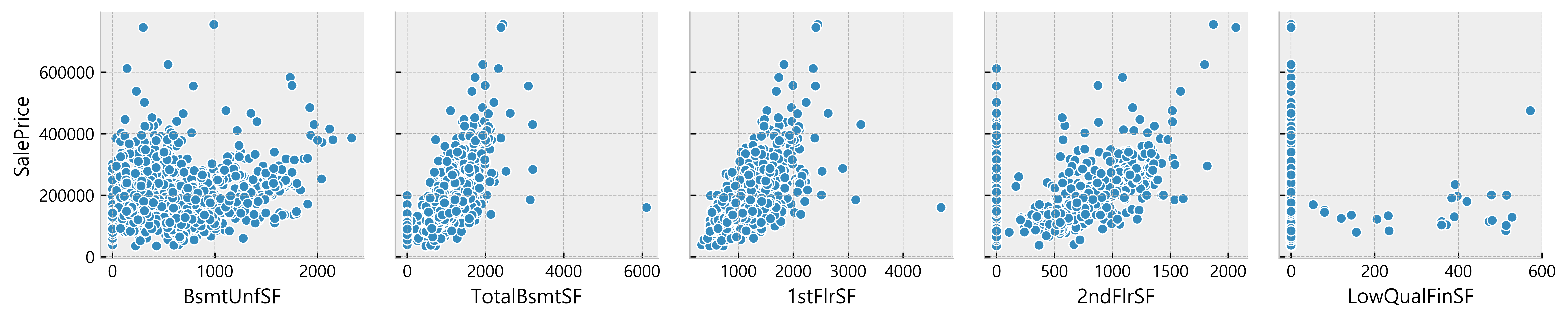
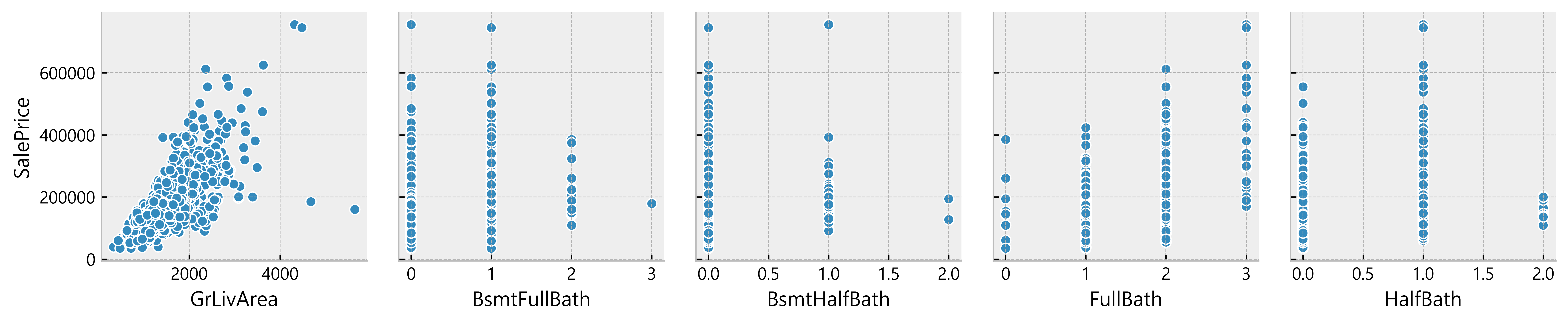

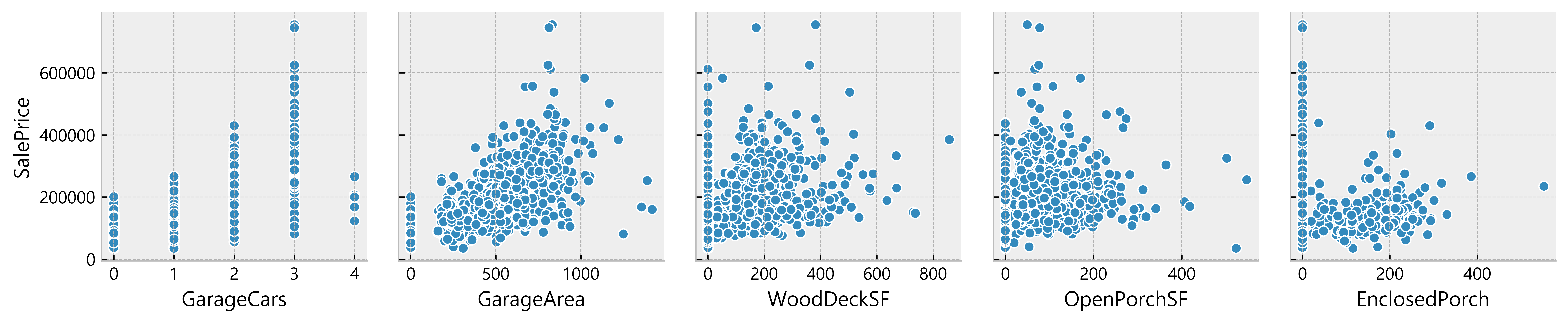

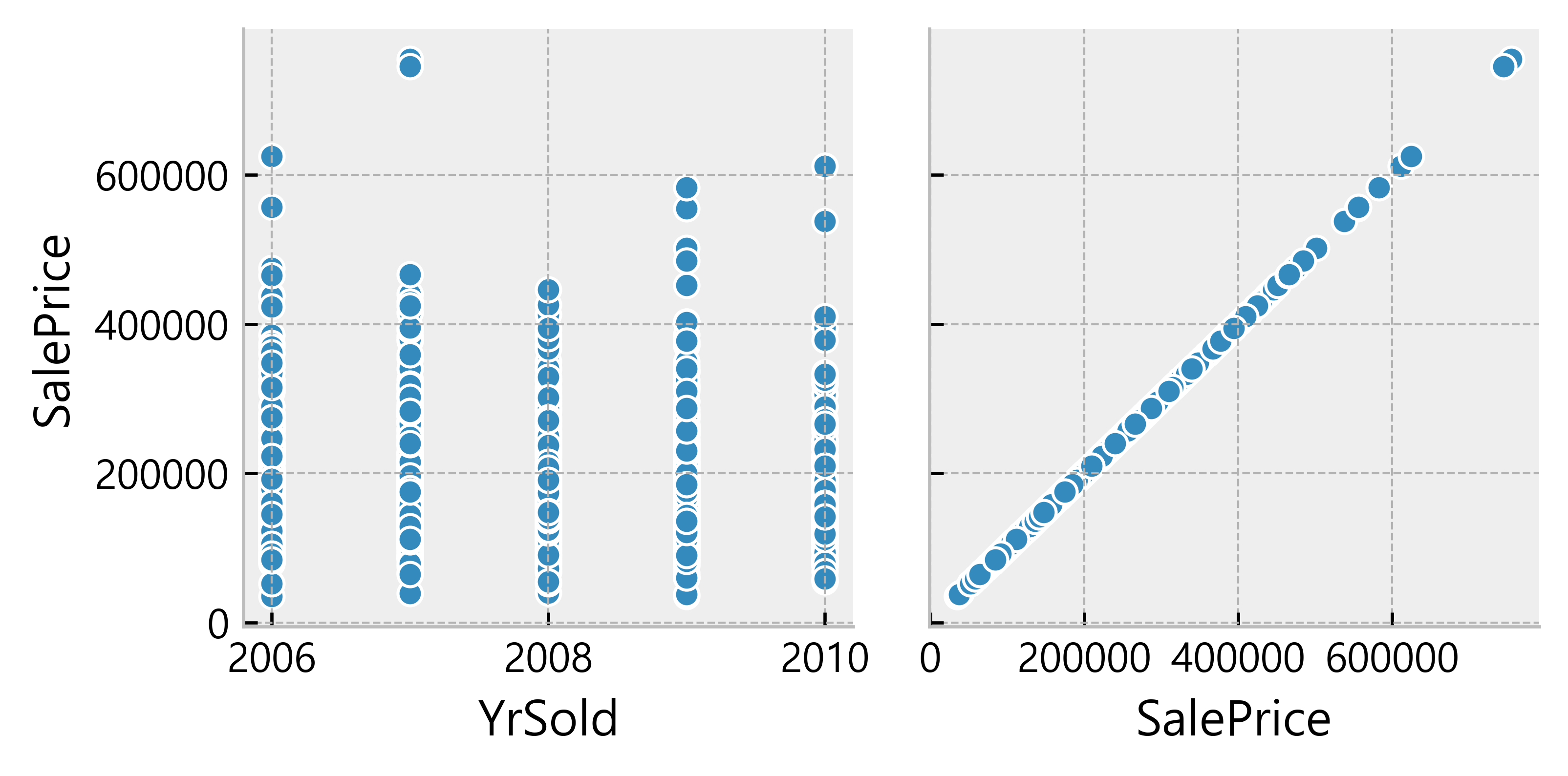
Deduction:
- Many data seem to have a linear relationship with the SalePrice
    - A lot of data points are located on x = 0
  Possible indication of absence of such features in the house)
More Data Cleaning
Removal of 0 values and repeat the process of finding correlated values
1 | import operator |
 KitchenAbvGr: -0.13920069217785566
     HalfBath: -0.08439171127179887
   MSSubClass: -0.08428413512659523
  OverallCond: -0.0778558940486776
       YrSold: -0.028922585168730426
 BsmtHalfBath: -0.028834567185481712
     PoolArea: -0.014091521506356928
 BsmtFullBath: 0.011439163340408634
       MoSold: 0.04643224522381936
    3SsnPorch: 0.06393243256889079
  OpenPorchSF: 0.08645298857147708
      MiscVal: 0.08896338917298924
   Fireplaces: 0.1216605842136395
    BsmtUnfSF: 0.16926100049514192
 BedroomAbvGr: 0.18093669310849045
   WoodDeckSF: 0.19370601237520677
   BsmtFinSF2: 0.19895609430836586
EnclosedPorch: 0.2412788363011751
  ScreenPorch: 0.25543007954878405
      LotArea: 0.2638433538714063
 LowQualFinSF: 0.3000750165550133
  LotFrontage: 0.35179909657067854
   MasVnrArea: 0.4340902197568926
   BsmtFinSF1: 0.4716904265235731
  GarageYrBlt: 0.48636167748786213
 YearRemodAdd: 0.5071009671113867
    YearBuilt: 0.5228973328794967
 TotRmsAbvGrd: 0.5337231555820238
     FullBath: 0.5745626737760816
     1stFlrSF: 0.6058521846919166
   GarageArea: 0.6084052829168343
  TotalBsmtSF: 0.6096808188074366
   GarageCars: 0.6370954062078953
     2ndFlrSF: 0.6733048324568383
    GrLivArea: 0.7086244776126511
  OverallQual: 0.7909816005838047
Conclusion
The most strongly correlated values are as follows in the golden_features_list.
1 | golden_features_list = [key for key, value in all_correlations if abs(value) >= 0.5] |
Following are the top 11 strongly correlated values with SalePrice:
['YearRemodAdd', 'YearBuilt', 'TotRmsAbvGrd', 'FullBath', '1stFlrSF', 'GarageArea', 'TotalBsmtSF', 'GarageCars', '2ndFlrSF', 'GrLivArea', 'OverallQual']
Feature to Feature Relationship
1 | corr = df_num.drop('SalePrice', axis=1).corr() |
Q –> Q (Quantitative to Quantitative relationship)
1 | quantitative_features_list = ['LotFrontage', 'LotArea', 'MasVnrArea', 'BsmtFinSF1', 'BsmtFinSF2', 'TotalBsmtSF', '1stFlrSF', |
| LotFrontage | LotArea | MasVnrArea | BsmtFinSF1 | BsmtFinSF2 | TotalBsmtSF | 1stFlrSF | 2ndFlrSF | LowQualFinSF | GrLivArea | ... | GarageCars | GarageArea | WoodDeckSF | OpenPorchSF | EnclosedPorch | 3SsnPorch | ScreenPorch | PoolArea | MiscVal | SalePrice | |
|---|---|---|---|---|---|---|---|---|---|---|---|---|---|---|---|---|---|---|---|---|---|
| 0 | 65.0 | 8450 | 196.0 | 706 | 0 | 856 | 856 | 854 | 0 | 1710 | ... | 2 | 548 | 0 | 61 | 0 | 0 | 0 | 0 | 0 | 208500 |
| 1 | 80.0 | 9600 | 0.0 | 978 | 0 | 1262 | 1262 | 0 | 0 | 1262 | ... | 2 | 460 | 298 | 0 | 0 | 0 | 0 | 0 | 0 | 181500 |
| 2 | 68.0 | 11250 | 162.0 | 486 | 0 | 920 | 920 | 866 | 0 | 1786 | ... | 2 | 608 | 0 | 42 | 0 | 0 | 0 | 0 | 0 | 223500 |
| 3 | 60.0 | 9550 | 0.0 | 216 | 0 | 756 | 961 | 756 | 0 | 1717 | ... | 3 | 642 | 0 | 35 | 272 | 0 | 0 | 0 | 0 | 140000 |
| 4 | 84.0 | 14260 | 350.0 | 655 | 0 | 1145 | 1145 | 1053 | 0 | 2198 | ... | 3 | 836 | 192 | 84 | 0 | 0 | 0 | 0 | 0 | 250000 |
5 rows × 28 columns
1 | features_to_analyse = [x for x in quantitative_features_list if x in golden_features_list] |
['TotalBsmtSF',
 '1stFlrSF',
 '2ndFlrSF',
 'GrLivArea',
 'FullBath',
 'TotRmsAbvGrd',
 'GarageCars',
 'GarageArea',
 'SalePrice']
The Distribution
1 | fig, ax = plt.subplots(round(len(features_to_analyse) / 3), 3, figsize= (18, 12)) |
We can see that features such as TotalBsmtSF, 1stFlrSF, GrLivArea have a big spread but I cannot tell what insights this information gives us
C -> Q (Categorical to Quantitative Relationship)
1 | # quantitative_features_list[:-1] as the last column is SalePrice and we want to keep it |
| MSSubClass | MSZoning | Street | LotShape | LandContour | Utilities | LotConfig | LandSlope | Neighborhood | Condition1 | ... | GarageYrBlt | GarageFinish | GarageQual | GarageCond | PavedDrive | MoSold | YrSold | SaleType | SaleCondition | SalePrice | |
|---|---|---|---|---|---|---|---|---|---|---|---|---|---|---|---|---|---|---|---|---|---|
| 0 | 60 | RL | Pave | Reg | Lvl | AllPub | Inside | Gtl | CollgCr | Norm | ... | 2003.0 | RFn | TA | TA | Y | 2 | 2008 | WD | Normal | 208500 |
| 1 | 20 | RL | Pave | Reg | Lvl | AllPub | FR2 | Gtl | Veenker | Feedr | ... | 1976.0 | RFn | TA | TA | Y | 5 | 2007 | WD | Normal | 181500 |
| 2 | 60 | RL | Pave | IR1 | Lvl | AllPub | Inside | Gtl | CollgCr | Norm | ... | 2001.0 | RFn | TA | TA | Y | 9 | 2008 | WD | Normal | 223500 |
| 3 | 70 | RL | Pave | IR1 | Lvl | AllPub | Corner | Gtl | Crawfor | Norm | ... | 1998.0 | Unf | TA | TA | Y | 2 | 2006 | WD | Abnorml | 140000 |
| 4 | 60 | RL | Pave | IR1 | Lvl | AllPub | FR2 | Gtl | NoRidge | Norm | ... | 2000.0 | RFn | TA | TA | Y | 12 | 2008 | WD | Normal | 250000 |
5 rows × 49 columns
non-numerical features
1 | df_not_num = df_categ.select_dtypes(include = ['O']) # Object(O) |
There are 39 non numerical features including:
['MSZoning', 'Street', 'LotShape', 'LandContour', 'Utilities', 'LotConfig', 'LandSlope', 'Neighborhood', 'Condition1', 'Condition2', 'BldgType', 'HouseStyle', 'RoofStyle', 'RoofMatl', 'Exterior1st', 'Exterior2nd', 'MasVnrType', 'ExterQual', 'ExterCond', 'Foundation', 'BsmtQual', 'BsmtCond', 'BsmtExposure', 'BsmtFinType1', 'BsmtFinType2', 'Heating', 'HeatingQC', 'CentralAir', 'Electrical', 'KitchenQual', 'Functional', 'FireplaceQu', 'GarageType', 'GarageFinish', 'GarageQual', 'GarageCond', 'PavedDrive', 'SaleType', 'SaleCondition']
“Looking at these features we can see that a lot of them are of the type Object(O). In our data transformation notebook we could use Pandas categorical functions (equivalent to R’s factor) to shape our data in a way that would be interpretable for our machine learning algorithm. ExterQual for instace could be transformed to an ordered categorical object.”
Definitely need more study on this especially on the transformation of data
1 | plt.figure(figsize= (10, 6)) |
(array([0, 1, 2, 3]), <a list of 4 Text xticklabel objects>)
1 | plt.figure(figsize= (12, 6)) |
(array([0, 1, 2, 3, 4, 5]), <a list of 6 Text xticklabel objects>)
1 | fig, axes = plt.subplots(round(len(df_not_num.columns) / 3), 3, figsize=(12, 30)) |
Deduction
Some categories are predominant for some features
e.g. Utilities, Heating, etc.